2008 Financial Crisis: A Macro Regime Analysis
Examine the 2008 Global Financial Crisis through a regime lens. Understand how growth, liquidity, and risk indicators evolved—and what lessons apply to future crises.
What You'll Learn
- Understand how the 2008 crisis unfolded through a regime lens
- See which indicators gave early warning signals
- Learn how liquidity dried up and was restored
- Apply lessons from 2008 to future crisis scenarios
The 2008 Global Financial Crisis (GFC) remains the defining macro event of a generation. It reshaped central banking, regulation, and investor psychology in ways that continue to influence markets today.
This article examines the crisis through VantMacro's regime framework—how indicators evolved, what signals emerged, and what lessons apply to future crises.
Timeline Overview
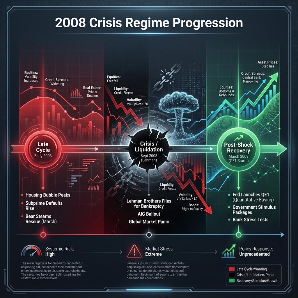
The crisis didn't happen overnight. It was a sequence of distinct macro environments:
The table below shows key points in the crisis with as-of readings from the underlying data series (monthly/weekly series use the latest available value on or before the date).
| Date | Chicago Fed Activity Index (latest) | Market Volatility (VIX) | High-Yield Credit Spread (basis points) | 10Y-2Y Yield Curve (basis points) | Fed Assets ($T) |
|---|---|---|---|---|---|
| 2006-12-01 | 0.77 | 11.66 | 321 | -9 | 0.86 |
| 2007-08-09 | -0.08 | 26.48 | 404 | 30 | 0.87 |
| 2008-03-17 | -0.78 | 32.24 | 862 | 199 | 0.90 |
| 2008-09-15 | -2.57 | 31.70 | 905 | 169 | 0.93 |
| 2008-10-10 | -1.12 | 69.95 | 1,536 | 227 | 1.59 |
| 2009-03-09 | -2.33 | 49.68 | 1,886 | 193 | 1.90 |
| 2009-04-01 | -1.60 | 42.28 | 1,712 | 185 | 2.08 |
Notes:
- CFNAI is monthly and WALCL is weekly; “as-of” values are not all same-day releases.
- HY OAS is shown in basis points (FRED reports percentage points).
What the Regime Classifier Shows (2008–2009)
The regime timeline is high-frequency, so labels can switch many times during crises. Two empirical anchor points from the 2003–2025 regime history:
- Longest Crisis/Liquidation stretch: 2008-09-15 to 2009-05-18 (246 days)
- Post‑Shock Recovery bursts: begin shortly after; the longest post‑shock stretch is 2009-07-09 to 2009-10-29 (113 days)
Empirically, Crisis/Liquidation most often transitions to Post‑Shock Recovery (~88.5%) in the historical transition matrix.
Our historical-example verification finds that 2009-04-01 to 2009-12-31 is a valid Post‑Shock Recovery window (64% of days match), but most narrative example windows for other regimes do not meet the verification threshold.
Key Indicators
Lead Indicators (What Warned First)
- Yield curve inversion (2006) — an early warning, but with long and variable lags
- Credit Spreads Widening (Jul 2007) — BNP Paribas froze funds
- Housing Starts Collapse (2007) — Residential investment -40%
- National Financial Conditions Index (NFCI) Tightening (Aug 2007) — Financial conditions deteriorating
Lagging Indicators (What Confirmed Too Late)
- Unemployment (2009 peak) — Rose from 4.7% to 10%
- Gross Domestic Product (Q4 2008) — Confirmed recession after the fact
- Corporate Earnings (2009) — S&P EPS fell 40%
Lesson: Lead indicators (yield curve, credit spreads, NFCI) gave warning. Lagging indicators (unemployment, GDP) confirmed what was already happening.
The Liquidity Story
Pre-Crisis Conditions
| Measure | 2006 | 2007 | 2008 |
|---|---|---|---|
| M2 YoY | +5% | +6% | +8% |
| Fed Balance Sheet | $850B | $900B | $900B |
| Net Liquidity | Not tracked | Not tracked | — |
Interestingly, M2 continued growing through the crisis—but credit growth collapsed. This shows why multiple liquidity measures matter.
The Policy Response
| Action | Date | Effect |
|---|---|---|
| Rate cuts (5.25% → 0%) | Sep 2007 - Dec 2008 | Traditional easing |
| QE1 announced | Nov 2008 | Fed began buying MBS/Treasuries |
| Fed Balance Sheet doubles | Q4 2008 - Q1 2009 | $900B → $2.2T |
| Global coordination | Oct 2008 | G7 joint rate cuts, guarantees |
Key insight: Traditional rate cuts weren't enough. QE—direct asset purchases—was required to restore market function.
Was There Warning?
Yes and no:
- Yield curve: Inverted well before the recession, but with long lags
- Credit spreads: Began widening well before the peak stress phase
- NFCI: Tightened materially during 2007–2008
- But: Timing was imprecise. Markets rallied after initial inversions.
Lessons for Future Crises
1. Lead Indicators Work—With Lag
The yield curve, credit spreads, and financial conditions all warned. But the lag was 12-24 months. Patience and discipline are required.
2. Crises Unfold Slowly, Then Suddenly
Bear Stearns collapsed in March 2008. Lehman collapsed in September. The interim period felt "managed"—until it wasn't.
3. Policy Response Matters
The Fed's initial rate cuts didn't work. Only QE—balance sheet expansion—restored market function. Future crises will likely require similar unconventional policy.
4. Credit Spreads Are Crucial
HY spreads went from ~300bp to ~1,900bp. This was arguably the best real-time indicator of crisis severity.
5. Don't Front-Run the Bottom
The S&P 500 bottomed in March 2009—but had fallen 57% from the peak. Calling the bottom in real-time was impossible. Regime analysis tells you when conditions are improving, not the exact bottom.
Comparison to 2020
| Aspect | 2008 GFC | 2020 COVID |
|---|---|---|
| Cause | Credit/housing | External shock (pandemic) |
| Speed | 18 months | 5 weeks |
| Fed response time | Months | Days |
| Peak VIX | 80 | 82 |
| Drawdown | -57% | -34% |
| Recovery time | 4 years | 5 months |
Key difference: In 2020, policy response was immediate. In 2008, it took months to calibrate. This shortened the crisis duration dramatically.
Summary
The 2008 crisis demonstrated:
- Lead indicators warned early — yield curve inversions and widening credit spreads signaled rising risk, but timing was uncertain
- Stress built in waves — volatility and credit did not move in a straight line; conditions deteriorated, then cascaded
- Balance sheet policy mattered — the Fed’s assets expanded sharply as crisis tools and QE were deployed
- Classifier output is high-frequency — crisis and recovery labels can interleave; the longest crisis stretch ran 2008-09-15 to 2009-05-18
- Nothing perfectly times the bottom — regime analysis helps contextualize risk, not call exact turning points
Data Sources
- FRED series: CFNAI (
CFNAI) — https://fred.stlouisfed.org/series/CFNAI - FRED series: VIX (
VIXCLS) — https://fred.stlouisfed.org/series/VIXCLS - FRED series: High Yield OAS (
BAMLH0A0HYM2) — https://fred.stlouisfed.org/series/BAMLH0A0HYM2 - FRED series: 10Y Treasury (
DGS10) — https://fred.stlouisfed.org/series/DGS10 - FRED series: 2Y Treasury (
DGS2) — https://fred.stlouisfed.org/series/DGS2 - FRED series: Fed Total Assets (
WALCL) — https://fred.stlouisfed.org/series/WALCL
Methodology
- Uses daily/weekly macro market series (volatility, credit spreads, yields, Fed balance sheet) to reconstruct the evolving stress backdrop across 2007–2009.
- Interprets the crisis through the same “regime” lens used on VantMacro: stress, liquidity response, and growth dynamics as they evolved through time.
- Focuses on high-signal, observable measures (VIX, HY OAS, curve behavior) rather than narrative-only explanations.
Limitations
- This is a retrospective, educational analysis; real-time decision-making is harder due to uncertainty, revisions, and incomplete information.
- Macro indicators are noisy and can conflict; no single series “explains” the crisis or times the bottom.
- Policy response and market structure today differ from 2008, so analogies should be used cautiously.
Further Reading
- Market Regimes Explained — The regime framework applied here
- COVID-19 Liquidity Flood — Compare to the 2020 crisis
- Fear & Greed Index — The stress indicators that spiked
Monitor Crisis Indicators on VantMacro
- Real-time VIX and credit spread tracking
- NFCI and STLFSI financial conditions
- Regime classification with historical context
Investment Disclaimer
The information provided by VantMacro is for educational and informational purposes only and should not be construed as financial, investment, legal, or tax advice.
Not Financial Advice: VantMacro provides economic data, regime analysis, and historical performance metrics. We do not recommend specific securities, investment strategies, or portfolio allocations. All content is for general information and should not be relied upon for making investment decisions.
No Guarantees: Past regime performance does not guarantee future results. Markets are unpredictable, and economic regimes can change rapidly. Historical data may not be indicative of future performance.
Consult a Professional: Before making any investment decisions, you should consult with a qualified financial advisor who understands your individual circumstances, risk tolerance, and financial goals.
Risk Disclosure: All investments carry risk, including the potential loss of principal. You are solely responsible for any investment decisions you make.
For complete disclaimer and terms, see our Full Investment Disclaimer and Terms of Service.